It is time to put aside the wasted time, stress and anxiety caused by combining fonts.
Nowadays, we come across several free platforms that provide us with an endless number of font options; among the favorites, Google Fonts. By offering too many fonts, we reach the point of being saturated with too many options and not knowing how to choose which one to use. That is why we have put together the best font combinations for your projects.
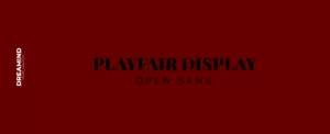
PLAYFAIR DISPLAY AND OPEN SANS
RALEWAY AND LATO
ELSIE AND ROBOTO
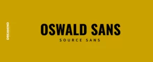
OSWALD SANS AND SOURCE SANS
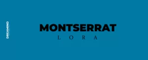
MONTSERRAT AND LORA
TYPOGRAPHIC GOLD TIPS
There are infinite guidelines and rules for typographic uses but very few are 100% established. The context of your project will depend on whether we break some of them or make exceptions to certain rules.
-
Choose complementary fonts
There are different fonts with different personalities, essences and moods; at the same time we can find serious, formal or casual, while others can be elegant or cheerful.
It is important to make sure that the personality of the typefaces match with your project's objective.
-
Establish a visual hierarchy
To establish a hierarchy for your design, it is important to ask yourself two essential questions: What is the first thing you want your audience to see and what is the least important thing you want to highlight; then focus on the style, size and layout of your font. Generally, larger or thicker text is taken into account as the main element; it will not only add dynamism to your project but will also make it easier to read.
-
Take care of spaces between lines and letters
Qualities such as size, thickness and spacing contribute to how the eye should navigate the page and which text should catch the eye first, as well as how easy it is to read. This tip is very important, as it can make a big difference in your texts. Try highlighting your project by spacing your headings and paragraphs.
-
Combines serif and sans serif fonts
Key of "the old reliable", try combining a serif and a sans serif font; it is an excellent option and more contrasting their sizes between them.
Serif fonts are said to have the functionality of eye-friendliness and speed of reading, especially for print; on the other hand, sans serif fonts, having simple, clear and dry stick fonts, are recommended for online texts.
-
Avoid similar fonts
Choosing similar fonts can be a mistake rather than a choice; it lacks the differentiating contrast to establish a hierarchy. An easy way to test whether two or more fonts may be too similar is to place them side by side on your screen, lean back in your chair and squint. If the fonts look virtually the same, it's a good sign that your design would be better with more contrast in your typefaces.
-
Use fonts of the same family
Look for font families that have a good range of style, lettering and weight options. Typefaces from the same family were created to work together, so don't be afraid and give it a try!
One of the benefits of limiting the fonts for a project to a single font family is the time savings in combining fonts and the simplification of the design process.
-
limit the number of sources
It is often said, that we should use two or three typefaces for a project; in general this is a rule for editorial cases, but it is not something stable for other types of projects. The important thing is, if you choose a variety of fonts, to cause an effect of harmony and not conflict.
-
Go for it!
Rules aside, we give you the advice to practice combining typefaces; like most creative endeavors, there is no exact formula for finding a perfect match, this is part of the trial and error process. So take a chance, try and experiment, in the process you will develop a sense of whether or not they match.


